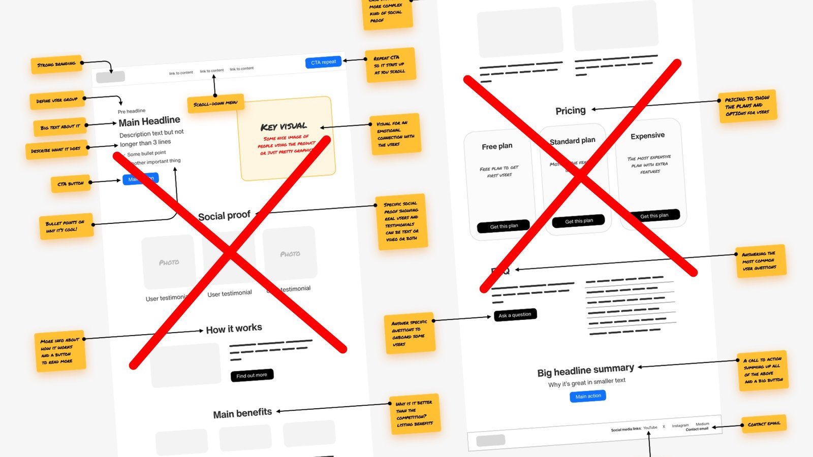
Don’t use landing page “conversion blueprints”. This is an expert deep dive into how those blueprints are made and why they’re bad for you.
Many social media posts share a high converting landing page blueprint. It’s usually long and complex and you think : “wow I need to follow that, sounds smart!”
Stop. Throw those away!
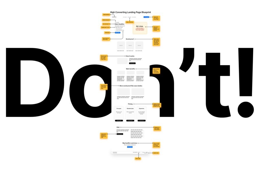
I’ll show you a two-step approach with which you’ll optimize your business yourself. Then I’ll tell you how to pick the right components for step 2 – the most important one.
And then you’ll be on your way getting more conversions.
Without all that pretend-complex BS people do to farm engagement.
But first let’s analyse a typical blueprint like that. Starting with the header.

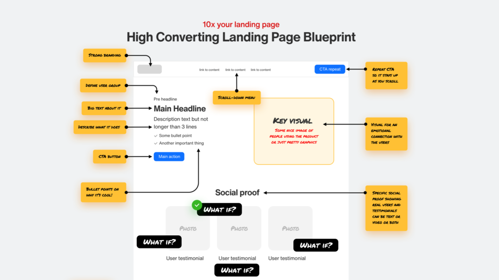
Let’s start from the top. They always start with “defining” the basics like the logo (1), navigation (2) and header CTA button (3). The problem here is that not all landing pages need navigation.
Some shorter ones may not even have any sections besides the header and some social proof below. The CTA is always presented like this in the blueprints. A big, visible, colorful button. Usually the exact same color as the main CTA (7) and with the same copy.
This is bad. Two identical CTA’s compete for attention and the user may not click any of them. The better approach is to dim the top CTA until you scroll down the page and then make it more visible.
The kicker (4) is often called a “pre headline” which frankly I have no idea what that means. What I often found in those blueprints is that it’s used to define the user group. Why? What for? Why here? This is definitely not universal and the goal of this section is in most cases completely different.
Main headline (5) is often explained as “big text about what it does”. If they’re more conscious they’ll say it’s about the benefits. Something about the benefits. Yeah, that’s reassuring.
Then we get to the description text (6), they often say it shouldn’t be longer than 3 lines of text. What does it mean? Is this universal? No. Once again this is NOT universal and for your brand it may hurt your conversions.
Then we have the main action (7) often labeled just as “CTA button”. Now that’s not very helpful when you want to increase conversion. The only thing it helps with is saying tha you probably need a CTA button on your website.
And we also sometimes have some bullet points (8) on why it’s cool. That assumes we always need them, but doesn’t specify either why or what to even write there.
This is utterly useless.
Key visual
Then we get to the key visual (9)
People resonate extremely well with images. No wonder they say an image is worth a thousand words. But in the blueprint it usually says something vague like “add a nice graphic here”. Barely any of them mention how it should be connected to the copy content on the left side.
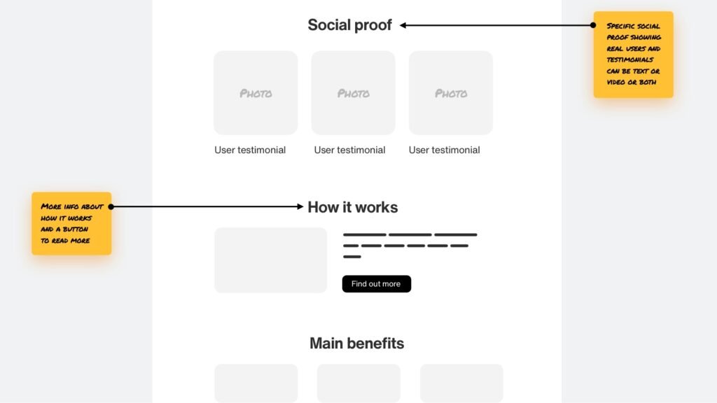
Then we add a social proof section and a “how it works section”. That can make sense for some sites but think about it! Does every site need the same kind of social proof? In the same place? And does it always need to be followed by “how it works”?
No. This is assuming the needs of the users are always the same and it’s an approach that can lead to frustration. Long websites with all those sections and no thought given into them will lead to more people clicking off.
That hurts conversion.

Same with main benefits and “more social proof”. In some cases you need to show the benefits right at the top. In others, you don’t want to even mention your competitors.
Some sites will require JUST the complex, case study like social proof, so it would have to be higher in the site structure.
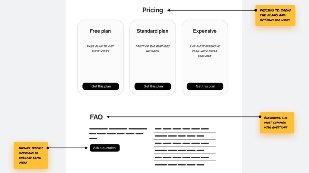
FAQ is something most sites do need, but with pricing it’s a lot more tricky.
Showing pricing right away can have a negative effect, because you’re clearing product related doubts on the main page, then hitting the users with the prices.
Having pricing on a separate page can help you dedicate that entire pricing page to just clearing the pricing doubts. That almost always leads to higher conversions.
With cheap products having the pricing on the main page can work, but it’s definitely not the only solution.
I won’t even go into the footer at this point, as I think you are already aware of what my goal is.
There is no one-size fits all blueprint.
The order can (and will) change. And including all those sections contributes to the cognitive overload. Sometimes less sections will help with MORE conversions.
So let’s talk about a better approach.

The Two Step Landing Page Conversion process
The first rule of conversion is understanding why it happened.
To make this simpler I’m assuming you have a product or service that has actual value.
So why did someone buy from you online?
One thing you can do is ask them in emails. Do a little follow up and hear what they say. There can be some obvious, predictable reasons, but there can also be reasons you never even thought of!
That is a great way to hear about customer pain points your product is solving. You can use those in step 2 later.

Addressing a pain point
Step one is addressing a pain your customer has. They need to know you’re here to solve it for them.
It can be anything, from spending too much time posting on social media (reactable), not having a good converting website (squareblack), to being stuck while learning design (academy).
Of course, in some cases the pain point is just about now having this new, beautiful, shiny thing you sell. That works especially well for physical products. Apple excels at this, but so do many craft small shops.

This is what we start with. You show the problem and your solution and you have about 4 seconds before they get bored and click away.
That’s why it needs to clearly be defined what problem you’re solving, for whom and how.
Step 2 – clearing doubts
If step 1 is telling your customer “hey, we have a solution to your problem!” step 2 is about clearing doubts.
Of course they don’t trust you right away. People need time for that. How much time?
About 2 minutes to even consider the decision. If you fail to clear most doubts within two minutes, your chances decrease. This is why cramming all the possible sections under the header can be a good idea.
You’re making the time to browse the site longer but you’re not sure whether you’re clearing doubts, or just adding more reading material.
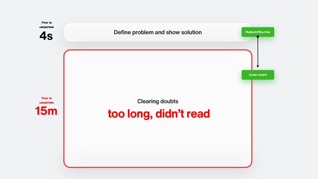
Here’s what happens.
A customer comes to your website.
Sees the main headline and thinks: “well it’s kind of exactly what I need!”
But the sale doesn’t happen.
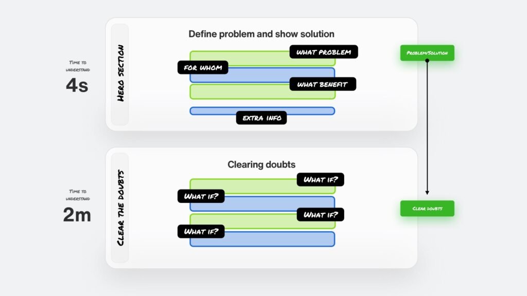
That’s because right after that thought they also hear this in their head:
“What if it’s a scam?”
“What if it doesn’t work?”
“What if…”
There’s hundreds of potential what ifs depending on the industry.

Successful sales page
A successful sales page is a mix of defining a solution to a problem and clearing doubts.
Throw away those long, complex blueprints. You need to build one that matches what you do based on just these two steps.
Problem and solution. Then clear doubts. But that second part differs every single time.
Not just for a different business category, but even for similar products or services within one category.
What you need to master is which elements and in which order will give you the most return on investment. And then constantly tweak it, ask the users and refine.
The guide
Here’s what I believe works better. We’ll do another blueprint, but this time with moving parts. I’ll also add proper, dedicated explanations to each section so you can figure out how to best adjust them to your business.
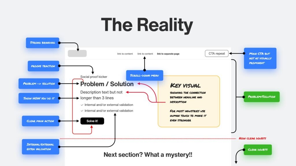
The hero section
The hero section is the top of your website. About as much as people see before they start scrolling.
You need to use that section to CLEARLY define what problem you’re solving and how.
There is also a little bit of space for small doubt clearing right here in the kicker. You can prove traction like state how many users you have.
The headline should be extremely clear. It needs to state a problem and right away provide a solution. Avoid empty words like Seamlessly or Empowering. They don’t mean anything.
Then the description should complement the headline – explaining a little more why it works and why should people care.
You can add internal or external validation to that as well. External is publications by others – like reviews in app stores or articles in respected magazines or portals. Internal is your user reviews, your numbers (paying users?) and the like.
It’s good to merge both, but for some businesses external works way better than internal.
CTA non-compete
Notice how the CTA on the top is just a white button. It can turn into a colorful, vibrant one as you scroll, but at first it doesn’t compete with the main CTA. One that’s connected to the messaging. The top one is just a backup.
The key visual can’t be random. Can’t be just some lighting effect or a 3d blob. It has to directly connect to the problem/solution in the headline. That mental connection is crucial for people to grasp why they should give you money.
Then we get to a clearing doubts section.
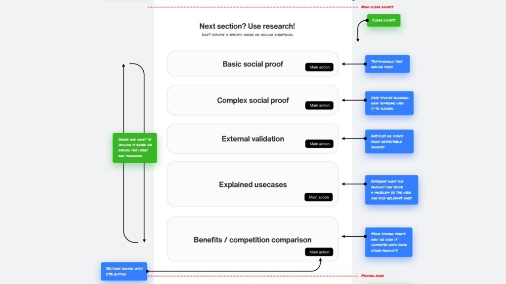
The clearing doubts parts
Once you figure out the hero, it’s time to clear the doubts.
First step is to ask your current users. What convinced them the most about buying from you. What was their biggest fear before they committed?
There are some universal doubt clearings that you likely should use either way, but there’s one thing everyone’s missing.
It’s not about adding as much content as possible onto the site. It’s about learning from your users and making the right clearing doubts order.
For some companies awards and metrics should go first. For others user reviews. Doing it randomly can still get you sales, but who knows how many sales you’re dropping because of …
cognitive overload.
By trying to cram all the possible clearing doubt content onto the site you make your users tired.
If they have to read too much, chances are they’ll click away.
It’s all a balance and that balance comes from research. Make sure to keep asking your customers with every redesign what convinced them the most. What were they fearing the most.
These things change!
The order changes. The elements themselves change too.
The social proof dillema
Nobody wants to go first
For any product, people are tribal. Nobody wants to try something as the first person. Showing how many users you have and their testimonials is a must for most businesses.
I will be covering social proof in depth in other articles and videos. Here’s one important advice that can cost you a lot of sales.
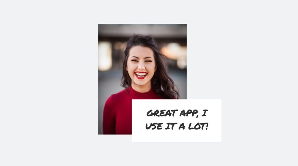
People have good visual memory
If you fake your testimonials using AI generated or stock photo faces of people, many will notice. They’ll feel something’s not quite right. They may have seen the pic on some other websites or even on the stock photo site itself.
The above example is one of the most overused stock photos out there. If this person is writing you a testimonial, many people will know it’s fake.
That stops buying decisions.
Same with AI generated photos. Most of them look superficial. People feel they’re not real.
If you want to start somewhere, get your friends and family as your first users and then slowly replace them with real ones.
The Two Step Process
You don’t need to copy some complex template. In many cases it will only hurt you.
Your website needs to be specific to both your business, the needs and the doubts of your specific users. Don’t just copy a template like the one above. Be smart about it!
Nailing, measuring and updating the two step process is the way to grow online.
Now go start optimizing!
